
I’ve just gotten a copy of the new ESV Reader’s Bible (Wheaton, Ill.: Crossway, 2014). My overall reaction to this presentation of the English Standard Version without chapter and verse numbers, headings, or footnotes is one of great delight. Let me elaborate with some comments on specific features of the volume.
First, by way of full disclosure, I should acknowledge that I was a member of the team that produced The Books of the Bible, an edition that similarly presents the Scriptures without any additives, first issued in the TNIV in 2007 and then in the latest update to the NIV in 2011. I have also done some consulting with the NIV translation committee, specifically concerning the visual formatting of the text in that translation.
Given this background, you can see why I am so pleased that Crossway has now issued another major translation of the Bible in a format that represents a design philosophy so similar to the one behind The Books of the Bible. As the introduction to the ESV Reader’s Bible observes about “modern editions”: “The addition of chapters, verses, and other non-inspired material can hinder us from reading large portions of Scripture without interruption. . . . We miss out on the flow of the argument, the arc of the story, and the broader context.” To help readers “get drawn into” the Bible instead, the new edition aims at a design that is “ancient in its similarity to the original manuscripts, yet familiar in its resemblance to the modern novel.”
One way the edition nicely achieves this “ancient” feel, beyond removing modern additives from the text itself, is by echoing the older practice known as rubrication, that is, putting all non-textual material in red. Medieval manuscript illustrators would, for example, put in red the names of books on the top of the page, chapter numbers in the margins (after these had been introduced), and notations within the text column that one book was ending and the next one was beginning. In a delightful nod to this ancient practice, the ESV Reader’s Bible (as shown in the image below from The Bible Design Blog) puts the book-chapter-and-verse range at the top of each page, the page number at the bottom, chapter numbers in the left margin, and book names at the start of each book all in red. (The Books of the Bible similarly puts all non-textual material in a different color to show that it is non-canonical and of lesser authority; in this case the color is gray, shaded back from the black of the text.)

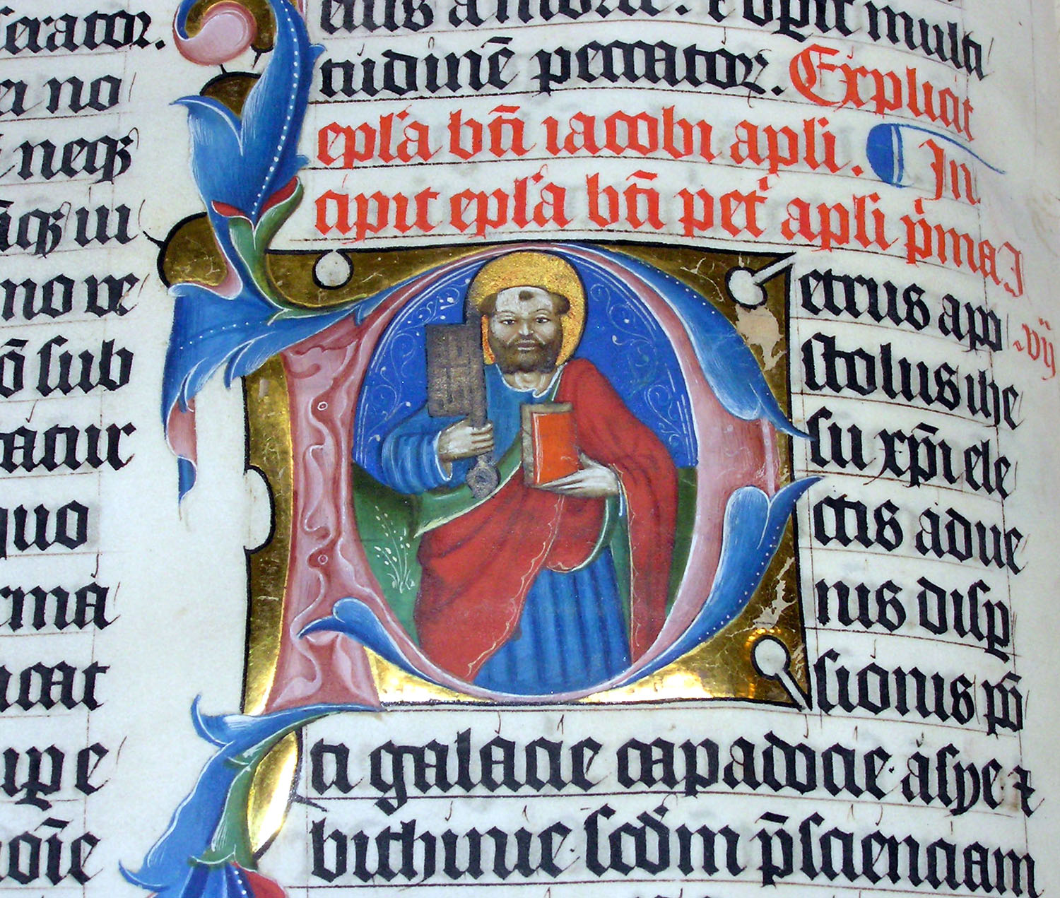
In another nod to tradition, the ESV Reader’s Bible also begins biblical books with large red drop caps. This is reminiscent of the way that the first letters of books were “illuminated” (illustrated) in manuscripts, as shown just below. In this example, the rubrication (writing in red) signals the end of the book of James and the start of Peter’s first epistle. The “P” in Peter (Petrus in Latin) is illustrated with an image of the apostle himself, identifiable by the key he is holding. (Drop caps are also used in The Books of the Bible, in black, to mark the largest literary sections of each biblical book.)
At the same time, this new edition also creates the feel of a “modern novel” by presenting the text in a single column, in an attractive contemporary font, and by removing the translation notes that appear as footnotes at the bottom of the page in standard editions of the ESV, referring readers to a website for them instead. (Translation notes are turned into endnotes and placed at the end of each book in The Books of the Bible.) The ESV Reader’s Bible even features two built-in bookmarks, as if to say, “You’re going to be reading through this Bible, not pulling out a verse here and there, so you’ll need to keep your place”—just as you’d have to do when reading through a novel.
I can see some areas for future improvement, though this does not at all diminish my delight in this publishing initiative. First, some necessary tradeoffs have been made in order to present the entire contents of the biblical canon in a single volume with a relatively small footprint. (The text box is only 4” x 6.5”.) The paper is thin, with noticeable bleed-through, and the margins are narrow, so that there are more words per line and per page than would be encountered in that “modern novel.”
I personally feel that electronic Bibles on smart phones and tablets are now filling the niche for take-the-whole-canon-with-you-everywhere Bibles, so that sit-down-and-read Bibles, intended for a different purpose, can be larger and heavier, with thick, opaque paper and wider margins, and even presented in multiple volumes. I think the remarkable interest now being shown in projects like Bibliotheca by Adam Lewis Greene, for example, illustrates this decisively. I’m looking forward eagerly to a time when Bibles are once again published in a way that allows them to grace home libraries as objects of beauty and visual elegance, seeing that they will no longer need to be slipped into a purse or a back pocket.
Another way the ESV Reader’s Bible could improve would be by representing the natural literary structure of the biblical books. Even though it removes chapter and verse numbers from the text, it still presents chapters visually as the basic compositional units of the Bible. A line space intervenes between chapters; the first word of each one is put in small caps; and that delightfully red chapter number appears in the left margin. Since the Bible was only divided into chapters around AD 1200, and since these chapters typically do not correspond with the natural divisions of the biblical material, relying on them in this way does not really lead us to “read Scripture precisely as it was originally written,” as the online promotional copy for this edition promises.
How much better it would be to use line spaces, small caps, etc. to highlight the natural structures of the biblical books. To give one simple example, Haggai consists of four oracles spoken by that prophet, each one beginning with a formula that dates it during the reign of King Darius. Why not put a line space between these oracles, and put the first words of each one in small caps? Now you’re really “reading Scripture precisely as it was originally written.” And why not also recombine divided books such as Luke-Acts and Samuel-Kings, and put collections such as Paul’s letters in their likely chronological order, rather than continuing to arrange them by length, as in traditional Bibles? (These initiatives are all undertaken in The Books of the Bible.)
Still, even with room to explore future refinements, the ESV Reader’s Bible is already a very welcome presentation of an important modern translation in an appealing, readable format. I believe it will fulfill its intended purpose of helping readers “get drawn into the stories, characters, and events that comprise . . . the Story of God’s redemption of humanity and all of creation.” That being the case, it has opened up another front against the “atomization of the Scriptures” (to quote its introduction one last time) that occurred in modernity. Well done.
For a feature-by-feature comparison of the ESV Reader’s Bible with the two other Bibles without chapters and verses that I mention here, The Books of the Bible and Biblotheca, see this post.

The bible is a complete package. All that we desire is in the word
But is the ESV Reader’s Bible really another translation? If one compares the ESV with the ESV Reader’s Bible, do you not really have a admit that you have another translation? Why not call it something other than the ESV when there are differences?
When the ESV Readers Bible was first published, the text was exactly the same as in standard editions of the ESV. Only the formatting was different. However, I believe there has been a revision to the ESV since the Reader’s Bible was published, and so there would now be some differences in the text unless the Reader’s Bible is updated. Still, this is not a different translation, but a different edition of the same translation.