
I’ve been an enthusiastic backer of The Word for Word Bible Comic since April 2014, when the project first went public with a Kickstarter campaign. (Here’s my original post endorsing it in its early stages: Can a graphic novel presentation of Scripture still be the Bible? In this case, yes.) It’s been a privilege to be one of the many resource people that the artist in England, Simon Amadeus Pillario, has reached out to repeatedly over the past two and a half years to ensure that his work is “historically accurate, unabridged, and untamed . . . with a high view of Scripture.”
Today the first two books in the series, Judges and Ruth, go on general release. I can heartily encourage all of you to get your own copies! (You can order them here.) For all of the reasons I give in my earlier post, this project will enable you to read these biblical books—every word of them—while immersing yourself in an authentic visual experience of the culture and customs of the times. (For example, Philistine warriors aren’t dressed like Roman soldiers. Pottery and furniture are authentic to the period. And, as I note in my first post, the art in the series even follows the shift from four-spoked wagon wheels to six-spoked wheels, when that shift occurs historically.)
Let me illustrate the kind of choices that Pillario has had to make along the way to giving us this authentic presentation through the example of one issue he asked for advice about last month, as the books were heading for the printer. Here’s the cover of Judges:
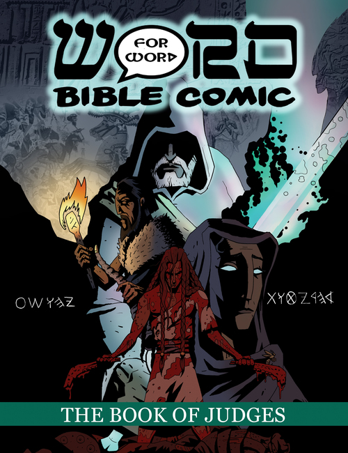
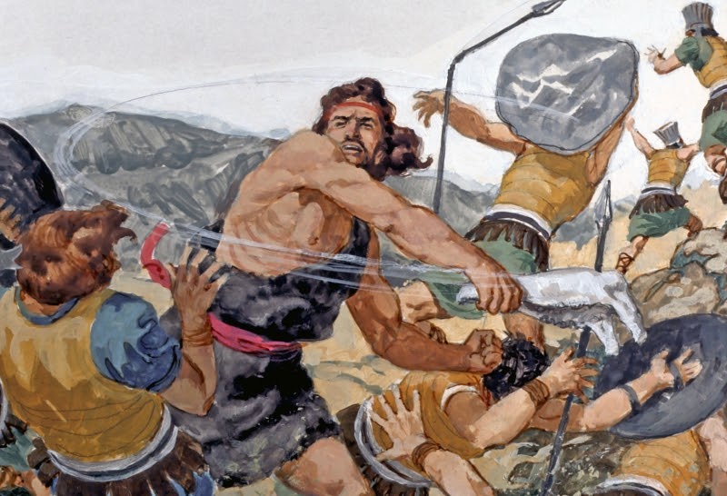
As you can see, it depicts several characters from the book, including (from top to bottom) the angel of Yahweh, Gideon, Deborah, and Samson. Samson has just killed a thousand Philistines with the jawbone of a donkey and, as should be expected, he is covered in their blood. This is different from the visual treatments of the episode we may be used to, such as this one, in which somehow no blood is spilled:
Pillario’s question was, Does my cover simply have too much blood on it? Someone had expressed a concern that it might be inappropriate, if these “Bible comics” were going to be placed where young children might see them. Pillario explained options such as making the blood brown rather than red, or presenting Samson as a red silhouette. (You can see all these options in his blog post on the topic.)
But by and large the people who responded, myself included, felt that the realistic depiction should be retained. I observed, “There’s already a 15+ advisory, so the comic isn’t supposed to be down where younger children can see it anyway. One of the best things going for Word for Word is its realism and authenticity. And, well, there’s lots of blood in the book of Judges.” (Of course we still need to come to terms theologically with how much blood is spilled in biblical books like this one. But the first step in that process is to admit that it’s there.)
Most others felt similarly. Another commented, “I think it’s cool. Top shelf in the church’s library, but cool.” And someone else advised, “I think you should make this, and everything in your adaptation of the Bible, as close and as faithful as possible. Definitely go with the bloody original. You wouldn’t make Christ’s crucifixion any less bloody and gory than it’s supposed to be.”
So the Judges graphic novel being released today still has its original cover. Pillario also invited input on the cover for the book of Ruth, in its early stages. For a look at all the considerations that went into that design, see this post on his blog.
But I don’t mean to focus all the attention on the covers. That’s just a way of giving you a feel for the care that has gone into these books. As a Kickstarter backer, I already have a prepublication coy of Judges, and I can testify that these graphic novels are full of amazing things inside. (For example, here’s a post with a link to a video about all that goes into a single interior page in Judges.)
Once again, I encourage you to get your copy of these eye-opening authentic treatments of the Scriptures!

Thanks, I ordered based on your rec. P.S. It asked why I ordered and mentioned this blog.
Excellent, the artist will be very pleased to know that.